Thursday, 2 December 2010
editing the video.
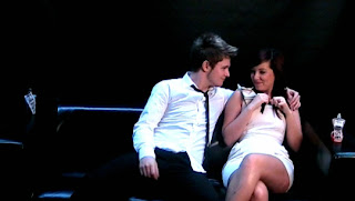
When filming we knew the colours wouldn't be bright enough. We want the advert to look as over the top as possible, so we spent a lot of time trying out different techniques on Adobe Premier Pro to really bring out the colours and shadows to enhance the audience's viewing and their reaction to the message we are trying to spread.


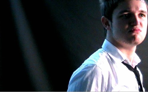
In the final stages of the editing we added a spot light to
these shots to enhance the selling point.

we used a slight pinky tone throughout the
more female adverts as it was very effective.

Whilst grading the shots we had to ensure that there was a high
contrast in order to make the blacks very black,
as this looked more professional than what we originally had.


Design of logo's and posters

These two logo's are for company's that work on keeping the public safe, this is why we have taken them as our main inspiration for this project. We're using one simple word, with a lot of meaning as the name of our company; False. Our slogan is "False; a lie we can all believe in"


These posters are a campaign against abuse in relationships. We loved the simplicity of it and felt this gave more of a hard hitting effect that people would really listen to.

This is our original idea, however it didn't include the two characters that we had created, although we loved the bright colours we didn't feel our message wasn't as clear and decided to develop this. keeping the colour style though.


Subscribe to:
Comments (Atom)